


Orbit books posted yesterday on their website the final cover for the upcoming follow-up to N.K. Jemisin The Hundred Thousand Kingdoms, The Broken Kingdoms. Seeing that, I remembered that I had already taken a look recently at the German cover for the book, via a link posted by Jemisin on her blog. As I began to search for it again, I found out many interesting (or not) German covers for the books I've read in the past. So, all this to say that I wanted to share this with you.
I'll start with six authors series but I've more and I have broken it into multiple parts. After this look at Germany, I'll be heading west to France, since it's been full of wonderful cover art lately. Here's the first part of my comparison :
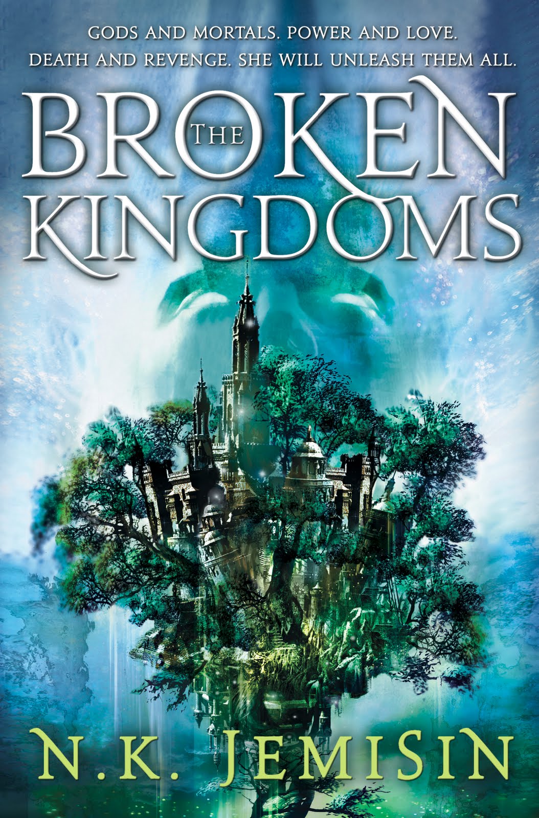
N.K. Jemisin - The Inheritance trilogy
Although I like the blanvalet covers, the US/UK cover is still much better, depicting the city of Sky. By the way, the US/UK Broken Kingdoms cover art was unveiled officially this week. Though call, but I'll go with the US/UK, and you?
| German | US/UK |
 |  |
 |  |
Scott Lynch - The Gentleman Bastard sequence
Next up is Scott Lynch's series. I did not include The Lies of Locke Lamora since it's the same cover art. This time, my vote is a split. The German cover for Red Seas Under Red Skies is looking better as far as my taste goes, but the Republic of Thieves cover is way more beautiful in the UK. I have included some alternate covers after the comparison (US RoT and a couple of RSURS).
| German | US/UK |
 |  |
 |  |

Peter V. Brett - The Warded Man (or Painted Man) and The Desert Spear
For The Desert Spear, it's an easy choice, seeing a well rendered Jardir is a sure win. However, for the Warded Man... both are kind of boring, not much to add...
| German | US/UK |
 |  |
 |  |
Joe Abercrombie - The First Law trilogy and Best Served Cold
A distinct winner this time, the US/UK covers. I really like the style while the German covers look like any other fantasy novel. I have added the MMPB editions of The First Law trilogy (they look even better than the original covers) and the other covers for Best Served Cold (US and MMPB).
| German | US/UK |
 |  |
 |  |
 |  |
 |  |


R. Scott Bakker - The Prince of Nothing trilogy
Tough call! First there is multiple covers for the US and UK and at least two of them look great (I really don't like the covers with a guy in a circle). The medieval scenes pictured in the latest US/UK edition is nice but I had something for the original art style (I even bought the first book because of the cover without having heard about Bakker). The German covers are not bad but not really representative...
| German | US/UK |
 |  |
 |  |
 |  |


Patrick Rothfuss - The Name of the Wind
Finally for the first part, The Name of the Wind. Here again, my vote would go with the German cover art, but it's a close call. The cover I chose to compare is the MMPB cover. Everyone must remember the infamous Fabio cover (totally awful) and although the darker set of colors is interesting in the MMPB cover, I think Kvothe is better represented in the German art.
| German | US/UK |
 |  |

Next up? Erikson, Martin, Hobb, Lloyd, Keyes, Durham, Evans, Sanderson... :)


2 comments:
What an interesting post! I love seeing all the different covers!
Me too :) I'll try to post the rest soon.
Post a Comment